


Hello there! My name is Shivam, and today, I will show you how to create this beautiful horizontal scrolling parallax effect with HTML, CSS, and JavaScript.
.gif?updatedAt=1694121871938)
Wouldn't this look stunning on your blog or portfolio site?
To achieve this effect, we will use:
• HTML - to add the images and content
• CSS - to style the horizontal scroll container and image wrappers
• JavaScript - to initialize Lightbox for image popups
Sound good? Open up your code editor, and let's get started! We'll be working with 2 files:
index.html: Our HTML file with the scroll container and imagesstyle.css: The CSS styles to position and transform the images on the scroll
Create these 2 files now so you're ready to follow along!
HTML Structure: Setting the Stage
First, we'll set up the basic HTML structure. This is the foundation upon which our parallax scrolling masterpiece will be built.
<!DOCTYPE html>
<html lang="en">
<head>
  <meta charset="UTF-8">
  <meta name="viewport" content="width=device-width, initial-scale=1.0">
  <title>Document</title>
</head>
<body>
  <!-- Content  -->
</body>
</html>
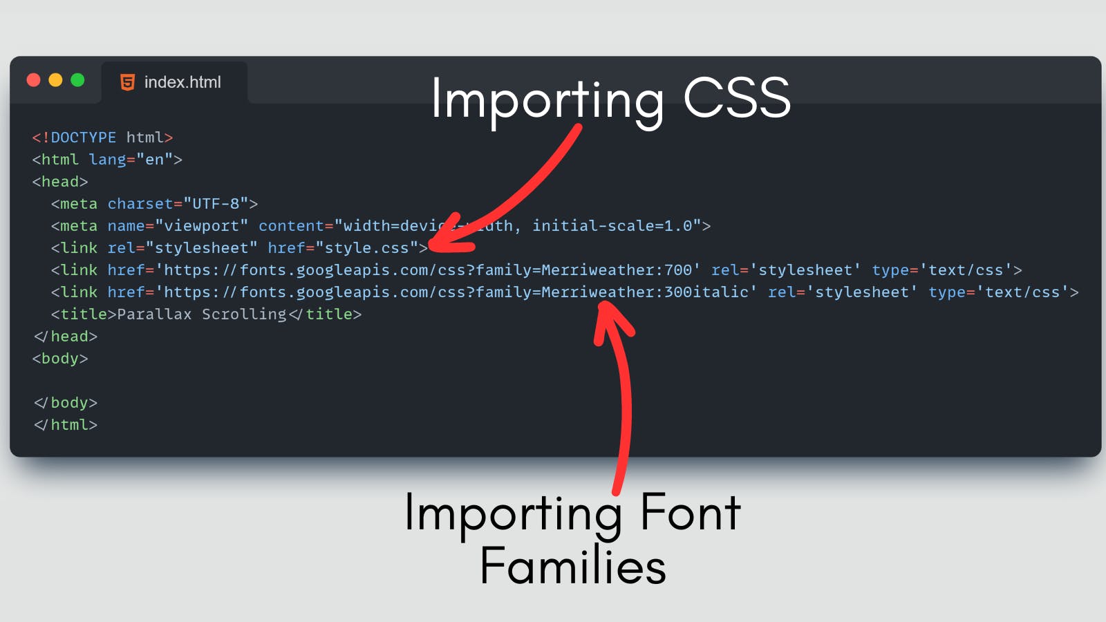
Let's first import our CSS and a few font families that we will use to style our fonts.
<!DOCTYPE html>
<html lang="en">
<head>
  <meta charset="UTF-8">
  <meta name="viewport" content="width=device-width, initial-scale=1.0">
  <link rel="stylesheet" href="style.css">
  <link href='https://fonts.googleapis.com/css?family=Merriweather:700' rel='stylesheet' type='text/css'>
  <link href='https://fonts.googleapis.com/css?family=Merriweather:300italic' rel='stylesheet' type='text/css'>
  <title>Parallax Scrolling</title>
</head>
<body>
  <!-- Content  -->
</body>
</html>
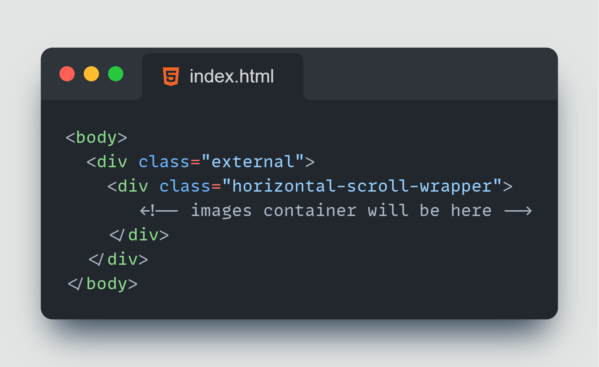
We will create a main container (<div class="external") for the parallax scrolling page. This container holds everything we see on the webpage. 👇
<!DOCTYPE html>
<html lang="en">
<head>
  <meta charset="UTF-8">
  <meta name="viewport" content="width=device-width, initial-scale=1.0">
  <link rel="stylesheet" href="style.css">
  <link href='https://fonts.googleapis.com/css?family=Merriweather:700' rel='stylesheet' type='text/css'>
  <link href='https://fonts.googleapis.com/css?family=Merriweather:300italic' rel='stylesheet' type='text/css'>
  <title>Parallax Scrolling</title>
</head>
<body>
    <div class="external">
    <!-- All the cards will be  here -->
  </div>
</body>
</html>
Within the main container, we will create a<div class="horizontal-scroll-wrapper"> that will enable horizontal scrolling. This is where the magic of parallax scrolling happens. 👇
Now, Each image is placed inside a <div class="img-wrapper">. These image containers will move at different speeds, creating the parallax effect.
<body>
  <div class="external">
    <div class="horizontal-scroll-wrapper">
      <div class="img-wrapper" >  <!--  <-- Image Wrapper-->
        <!-- images will be here -->
      </div>
    </div>
  </div>
</body>
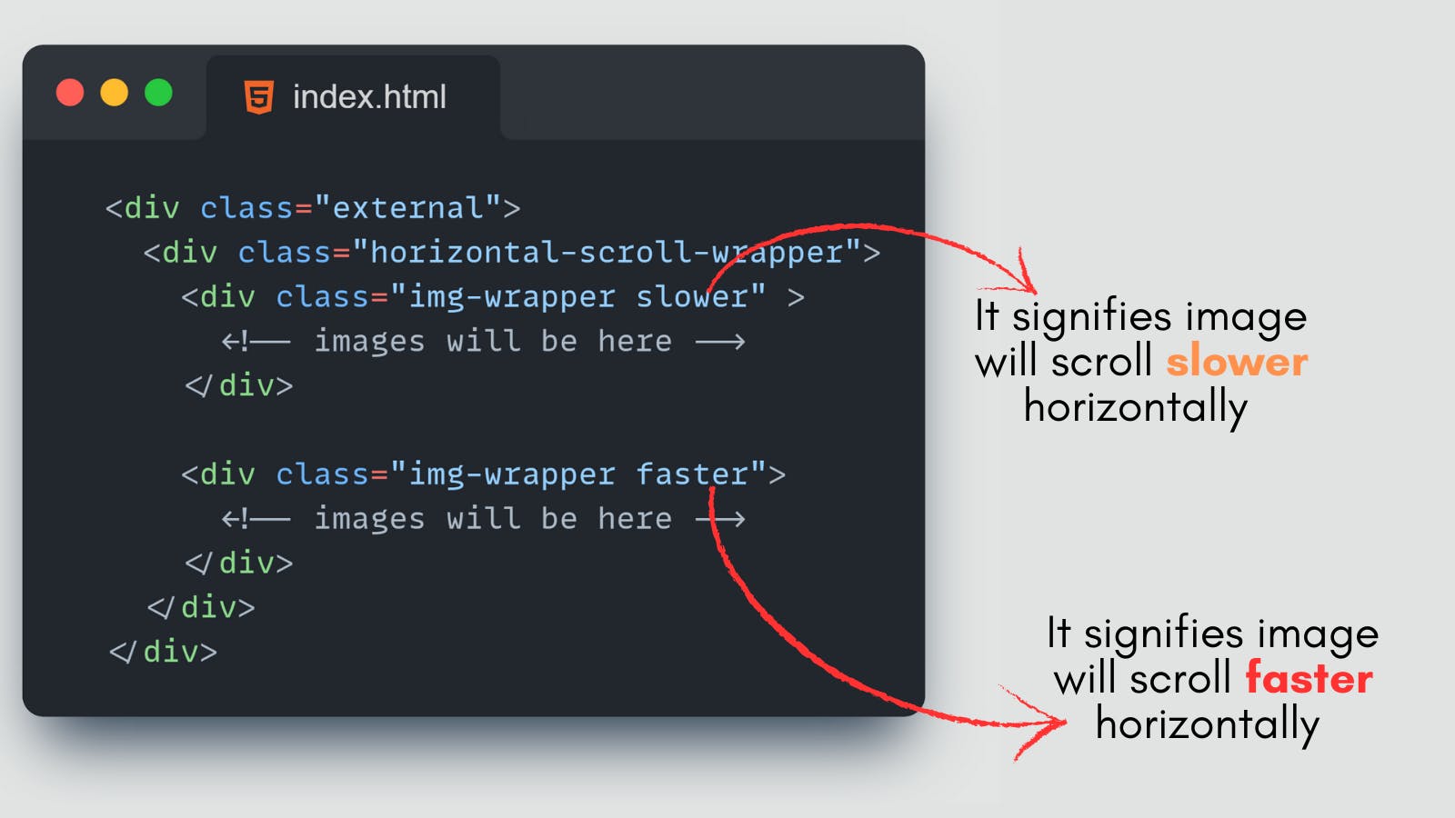
Now, within the "img-wrapper" we will use different classes like "slower", "faster", and "vertical" to control the speed and behavior of individual image containers.
<body>
  <div class="external">
    <div class="horizontal-scroll-wrapper">
      <div class="img-wrapper slower" >
        <!-- images will be here -->
      </div>

      <div class="img-wrapper faster">
        <!-- images will be here -->
      </div>
    </div>
  </div>
</body>
Let's delve into the details of why these different classes are used:
slowerClass: This class is applied to the first image container. It signifies that this image will scroll slower horizontally compared to other images. It adds a parallax effect by creating a visual difference in the scroll speed between this image and the rest of the content.fasterClass: The second image container is assigned the"faster"class. This class suggests that this image will scroll faster horizontally. It moves ahead of the scrolling speed of the other content, enhancing the parallax scrolling effect.verticalClass: The third image container combines both the"slower"and"vertical"classes. It indicates that this image will not only scroll slower but also in a slightly vertical direction. This creates a more complex and intriguing parallax effect, as it deviates from the purely horizontal movement of the other images.
You can add an image inside the image containers.👇
<div class="img-wrapper slower" >
  <a href="https://cdn.pixabay.com/photo/2013/07/18/20/26/sea-164989_640.jpg" target="_blank"
     rel="noopener">
    <img src="https://cdn.pixabay.com/photo/2013/07/18/20/26/sea-164989_640.jpg" alt="">
  </a>
</div>
Note
src URL and href URLs are the same. Reason? We will cover it later in this blog.Now, you can add more images inside all the img-wrapper containers.👇
<!DOCTYPE html>
<html lang="en">
<head>
  <meta charset="UTF-8">
  <meta name="viewport" content="width=device-width, initial-scale=1.0">
  <link rel="stylesheet" href="style.css">
  <link href='https://fonts.googleapis.com/css?family=Merriweather:700' rel='stylesheet' type='text/css'>
  <link href='https://fonts.googleapis.com/css?family=Merriweather:300italic' rel='stylesheet' type='text/css'>
  <title>Parallax Scrolling</title>
</head>
<body>
  <div class="external">
    <div class="horizontal-scroll-wrapper">
      <div class="img-wrapper slower" >
        <a href="https://cdn.pixabay.com/photo/2013/07/18/20/26/sea-164989_640.jpg" target="_blank"
        rel="noopener">
        <img src="https://cdn.pixabay.com/photo/2013/07/18/20/26/sea-164989_640.jpg" alt="">
      </a>
      </div>

      <div class="img-wrapper faster">
        <a href="https://cdn.pixabay.com/photo/2013/07/18/20/26/sea-164989_640.jpg" target="_blank"
        rel="noopener">
        <img src="https://cdn.pixabay.com/photo/2013/07/18/20/26/sea-164989_640.jpg" alt="">
      </a>
      </div>
<!-- add as many as you want -->

 </div>
  </div>
</body>
</html>
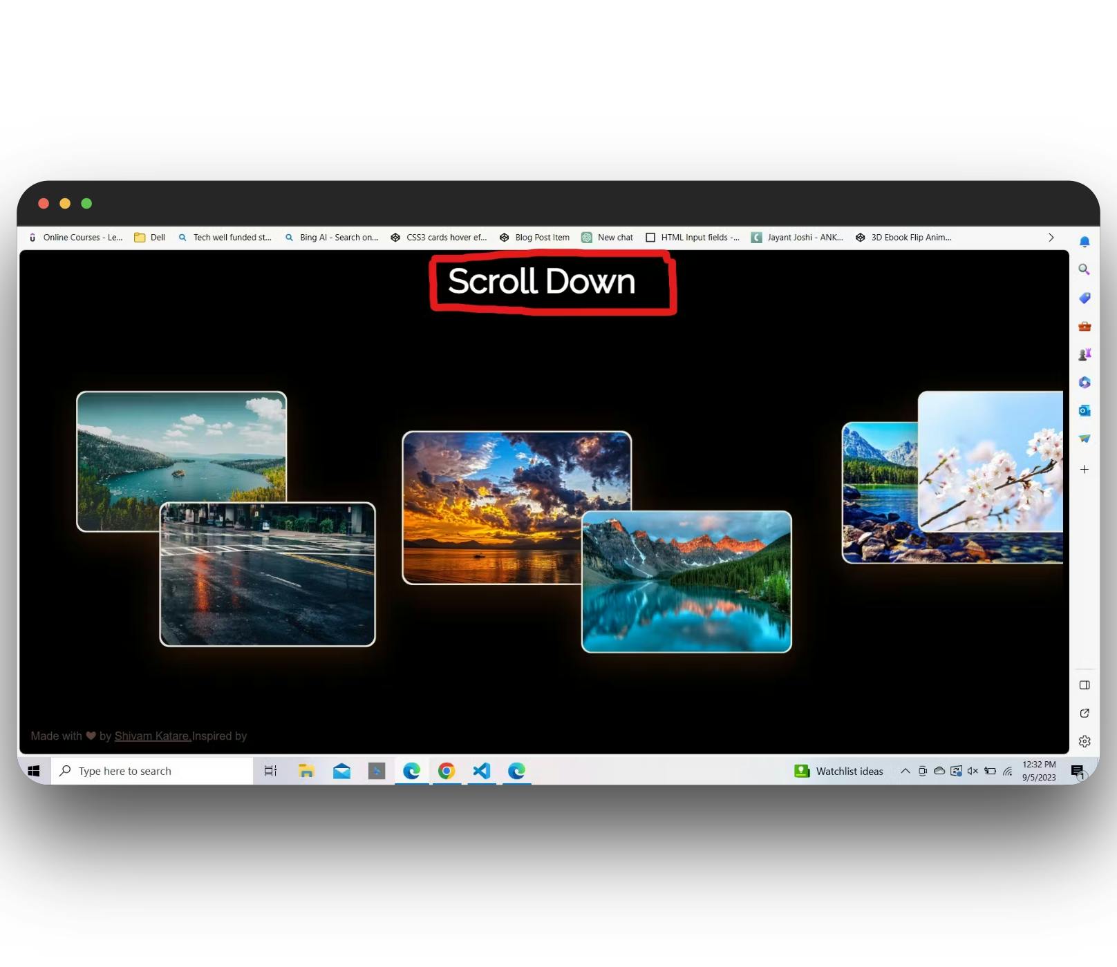
Now, our HTML part is almost over. We need to add this heading👇 [It's an optional thing]
<!DOCTYPE html>
<html lang="en">
<head>
  <meta charset="UTF-8">
  <meta name="viewport" content="width=device-width, initial-scale=1.0">
  <link rel="stylesheet" href="style.css">
  <link href='https://fonts.googleapis.com/css?family=Merriweather:700' rel='stylesheet' type='text/css'>
  <link href='https://fonts.googleapis.com/css?family=Merriweather:300italic' rel='stylesheet' type='text/css'>
  <title>Parallax Scrolling</title>
</head>
<body>
    <div class="external">
    <div class="horizontal-scroll-wrapper">
    <!--image content -->
    </div>
    <p class="scroll-info" style="display: grid;">Scroll Down</p> <!-- Scroll down text-->
  </div>
</body>
</html>
- The Output will look like this
.gif?updatedAt=1694122342925)
CSS Styles: Crafting the Parallax Magic
Let's delve into the CSS that transforms this HTML structure into a mesmerizing horizontal parallax scrolling experience. We'll break it down section by section.
Global Styles
@import url(https://fonts.googleapis.com/css?family=Raleway);

body {
  font-family: Hepta Slab, sans-serif;
  font-weight: 500;
  background: #000000;
  color: #5D4037;
}

* {
  box-sizing: border-box;
}

/* Hide scrollbar */
::-webkit-scrollbar {
  width: 1px;
  height: 1px;
}

::-webkit-scrollbar-button {
  width: 1px;
  height: 1px;
}
Here, we set up some global styles. We define the entire web page's font family, background color, and text color. We also hide the scrollbar for a cleaner look.
Page Structure
.external {
  overflow: hidden;
  height: 100vh;
}

.horizontal-scroll-wrapper {
  display: flex;
  flex-direction: column;
  align-items: center;
  width: 100vh;
  transform: rotate(-90deg) translate3d(0, -100vh, 0); /* creates the horizontal scrolling effect */
  transform-origin: right top;
  overflow-y: auto;
  overflow-x: hidden;
  padding: 0;
  height: 100vw;
  perspective: 1px;
  transform-style: preserve-3d;
  padding-bottom: 10rem;
}
These styles set up the main structure of our horizontal scrolling page. We hide overflow, adjust dimensions, and use CSS transforms to create the horizontal scrolling effect.
Image Containers and Animation
.img-wrapper {
  transform: rotate(90deg);
  display: flex;
  align-items: center;
  justify-content: center;
  min-height: 40vh;
  transform-origin: 50% 50%;
  transform: rotate(90deg) translateZ(.1px) scale(0.9) translateX(0px) translateY(-3vh);
  transition: 1s;
}

.img-wrapper:hover {
  min-height: 65vh;
}

.slower {
  transform: rotate(90deg) translateZ(-.2px) scale(1.1) translateX(0%) translateY(-10vh);
}

.slower1 {
  transform: rotate(90deg) translateZ(-.25px) scale(1.05) translateX(0%) translateY(8vh);
}

.slower2 {
  transform: rotate(90deg) translateZ(-.3px) scale(1.3) translateX(0%) translateY(2vh);
}

.slower-down {
  transform: rotate(90deg) translateZ(-.2px) scale(1.1) translateX(0%) translateY(16vh);
}

/* You can adjust these styles according to your own choice */
/* You can add more classes here. Like I did below */👇

.faster {
  transform: rotate(90deg) translateZ(.15px) scale(0.8) translateX(0%) translateY(14vh);
}

.faster1 {
  transform: rotate(90deg) translateZ(.05px) scale(0.8) translateX(0%) translateY(10vh);
}

.fastest {
  transform: rotate(90deg) translateZ(.22px) scale(0.7) translateX(-10vh) translateY(-15vh);
}

.vertical {
  transform: rotate(90deg) translateZ(-.15px) scale(1.15) translateX(0%) translateY(0%);
}

.last {
  transform: rotate(90deg) translateZ(-.2px) scale(1.1) translateX(25vh) translateY(-8vh);
}
In this section, we define the styles for image containers. Each image container has animation properties, creating the parallax effect as you scroll.
After all these styles, it will look like this 👇
.gif?updatedAt=1694123321933)
Image Styles
.img-wrapper a {
  overflow: hidden;
  display: block;
  padding: 2px;
  background: #efecdb;
  box-shadow: 0px 12px 50px #5f2f1182;
  border-radius: 15px;
}

img {
  max-width: 45vh;
  max-height: 50vh;
  transition: .5s;
  vertical-align: top;
  border-radius: 15px;
}

a:hover img {
  filter: none;
}
Finally, we define styles for images and their behavior on hover, ensuring they fit seamlessly into our parallax scrolling experience.
Style Title
At last, you can add styling to this title. 👇

.scroll-info,
header {
  position: absolute;
  left: 1rem;
}

header {
  bottom: 1rem;
}

.scroll-info {
  top: 1rem;
  font-family: 'Raleway';
  font-weight: 800;
  font-size: 3rem;
  color: white;
}

a {
  color: inherit;
  font-weight: 500;

}

h1 {
  font-weight: 300;
  font-size: 1rem;
}
Enhancing Your Gallery with Lightbox2
Now, let's enhance our image gallery using Lightbox2. This JavaScript library creates beautiful galleries, providing users with a seamless viewing experience. Here's how to integrate Lightbox2 into your project:
Step 1: Include jQuery and Lightbox2 Libraries
Lightbox2 relies on jQuery, so make sure to include both jQuery and Lightbox2 libraries in your HTML:
<!-- Include jQuery -->
<script src="https://code.jquery.com/jquery-3.6.0.min.js"></script>

<!-- Include Lightbox2 JavaScript (after jQuery) -->
<script src="https://cdnjs.cloudflare.com/ajax/libs/lightbox2/2.11.3/js/lightbox.min.js"></script>

<!-- Include Lightbox2 CSS -->
<link href="https://cdnjs.cloudflare.com/ajax/libs/lightbox2/2.11.3/css/lightbox.min.css" rel="stylesheet">
Here's why we used each of these:
jQuery: Lightbox2 relies on jQuery for certain functionalities. jQuery simplifies JavaScript tasks, making it easier to work with the Document Object Model (DOM) and handle events.
Lightbox2 JavaScript: This script is the core of Lightbox2, providing the functionality for creating the lightbox effect.
Lightbox2 CSS: The included CSS file styles the lightbox components, such as the overlay, close button, and image display, to ensure a visually appealing presentation.
Step 2: Configure Lightbox Options
Once you've included the necessary libraries, it's time to configure Lightbox2's options to customize the behavior and appearance of your Lightbox gallery:
<script>
    lightbox.option({
        'resizeDuration': 200,
        'wrapAround': true
    });
</script>
Here's what each option does:
'resizeDuration': This option controls the duration (in milliseconds) of the image resizing animation when a user clicks on an image to open it in the lightbox. A value of 200 milliseconds provides a smooth and visually pleasing transition.'wrapAround': When set totrue, this option allows us to loop through images in our gallery. When we reach the last image and click 'next,' we'll go back to the first image, creating a seamless loop. This feature improves user navigation through multiple images.
Step 3: Enhance Image Links for Lightbox2
To make Lightbox2 work seamlessly, ensure that the href attribute of your image links matches the src attribute of the corresponding images. Additionally, include data-lightbox and data-title attributes in your links. These attributes tell Lightbox2 what image to display and provide a title for it. Here's an example:
<div class="img-wrapper slower">
  <a href="https://cdn.pixabay.com/photo/2014/01/22/19/44/flower-field-250016_640.jpg" target="_blank"
    rel="noopener" data-lightbox="my-image" data-title="Beautiful Flower Field">
    <img src="https://cdn.pixabay.com/photo/2014/01/22/19/44/flower-field-250016_640.jpg" alt="Flower Field">
  </a>
</div>
In this example, the href and src attributes have the same URL, ensuring Lightbox2 displays the correct image. The data-lightbox attribute with the value "my-image" identifies this image for Lightbox2, and the data-title attribute provides a title for the image.
Now, the complete gallery will look like this👇
Wrapping Up
And with that, we've built a fully functional horizontal parallax image slider using HTML, CSS, and JS!
Thanks for reading it. I hope it was insightful. All the source code used in this article is in my GitHub repository.
Follow ReactPlay blogs and read more interesting and insightful content.
If you liked the article, please post likes 👍, give it a ⭐, and share it in your circles.
Let's connect. I share content related to web development, technical writing, and Open Source.👇
Thanks for reading 😊